It’s time for this week’s edition of Man- day from Jensguy.
Jennifer has allowed me a second week in a row of tech blogging. If you find the content useful, please let us know in the comments section. If you would rather me to go back to baseball blogging, let us know about that as well. :)
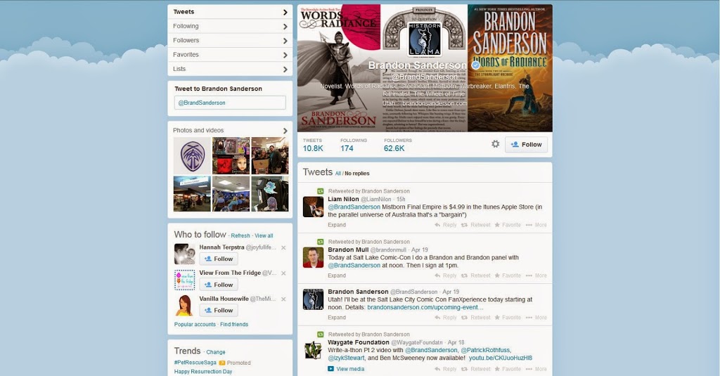
If you haven’t already heard, Twitter is revamping its user interface. Going from:
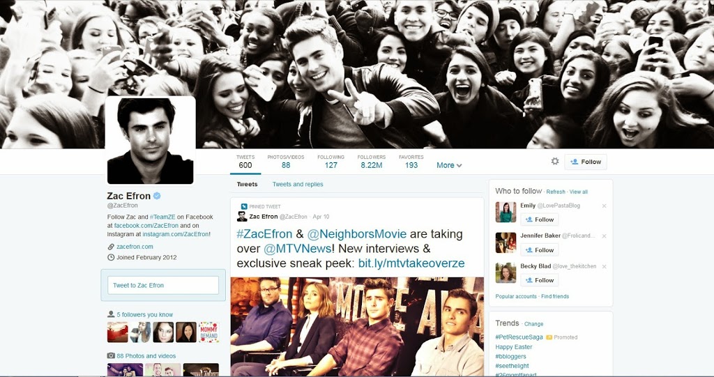
to
Much of the buzz around the internet has been about the resemblance to Facebook, and I suppose that there is some truth to that. The title picture is much larger with the profile picture inset on the side instead of square middle of the title picture, which was just plain annoying. Also the text used to describe yourself isn’t placed over the picture, which is just implementing common sense as much as it is imitating Facebook. The previous functionality really diminished design options.
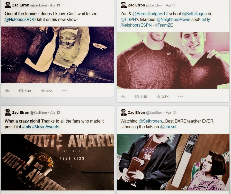
Additionally, it appears that Twitter is really going to focus on emphasizing photos which takes more of a nod from Instagram and Twitter than from Facebook. The rocket rise of Instagram is really turning heads. Notice that despite the main Twitter page now sporting three columns, the pictures in the Twitter stream are now more prominently displayed. And when you go to the “image only” view you get:
rather than this:
The old design was cute, but not nearly as effective in sharing content. I do hope Twitter comes up with a way to alter the thumbnail in the new design, however, as it seems to be cutting off people’s heads on Zac’s new page.
Quite frankly, this update by Twitter is long overdue, and removes some of the “geek” that made it harder to adopt for some users. And to those that want to complain that it looks too much like Facebook, I would point out the lack of garish ads, which has become the primary new “feature” set for the last few redesigns of Facebook. As I wrote about earlier, Facebook’s days are numbered.


