Hey guys! It’s me Jen. I’m mostly back. I haven’t left my house in over a week, other than one Dr.’s appointment where Jen’s Guy drove and I wrapped my neck in a Frosty the snowman scarf and sported a pair of super dark shades. I looked like a total gem, but… since I can’t turn my neck to look, I have no plans for driving in the near future, so maybe next time I will consider ditching the Frosty scarf. Just for Jen’s Guy’s sake. Maybe……
BUT the good news is that I am cancer free and on the mend. I will have a long, sappy post about all of this soon, but that would require more diligence and energy than I have this week so instead you are getting this fun one :) Loads of people have been helping keep my crew running this last little bit while I sat in a chair and moaned smiled happily, and so I have a ton of people to thank! In order to do so I whipped up a cute little thank you card over on PicMonkey and today I want to share with you how to make your own thank you cards. Or any card for that matter. It’s easy, cheap to do, and you can put whatever the heck you want on a card personalized for you and the receiver. Pretty fab right?!
So here goes, how to make cards people will love (with the help of PicMonkey, oh and if you decide to opt in and click on any of my link offers to get a royale package, I will receive a small compensation. Which will go straight towards my ice cream and doughuts fund. So thank you. You have no idea how much that is needed right now.)

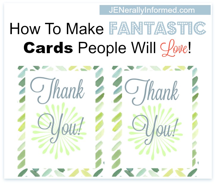
How To Make Fantastic Cards People Will Love!
Step 1
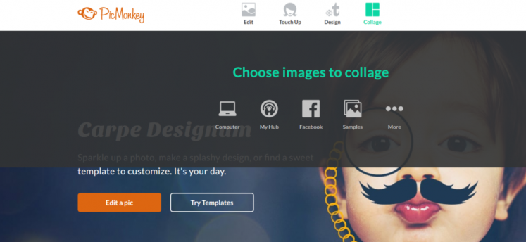
Log into PicMonkey. You can do everything I am going to do with a free account, but for just a few bucks each month, the royale package is pretty awesome!
Step 2
Select the collage option.
Step 3
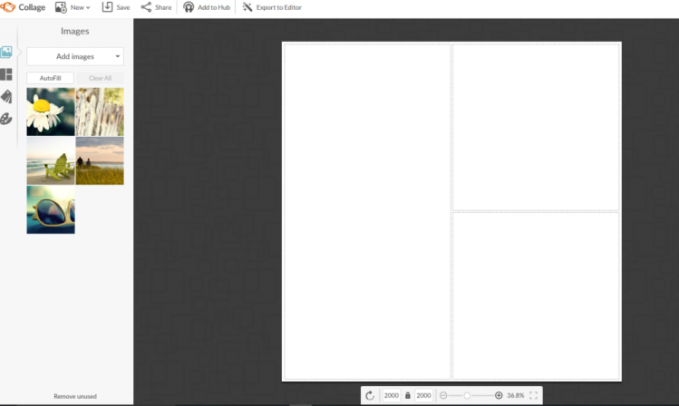
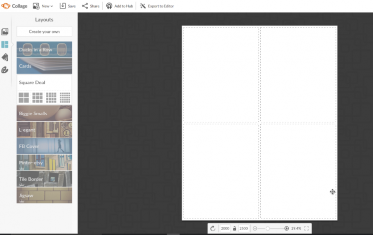
Over on the left side bar, select the square deal option.
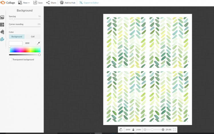
Then at the very bottom of the page are dimensions. You need to click on the little lock to allow you to play with the size. In order to be able to print on 8.5 x 11 inch paper, you need to change the dimensions to 2000 X 2500.
Step 4
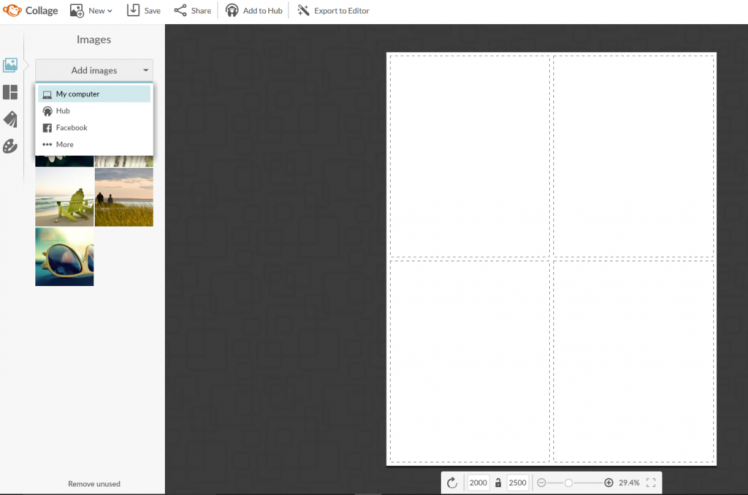
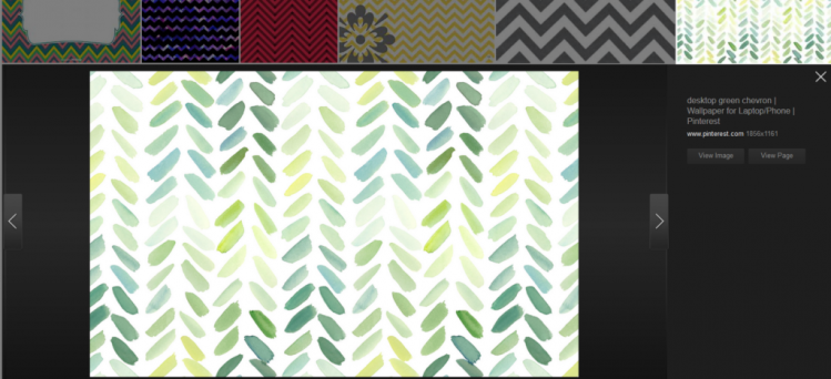
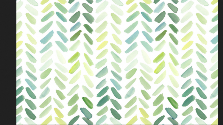
Select to add images. It gives you several options where you can pull pictures, but for this one I found a fun free cell-phone background online.
If you are going to use something from online, just don’t go grabbing nilly-willy. Make sure it isn’t copyright protected or that you aren’t stealing someone’s work. I do this by actually visiting the page where the image comes from and checking around.
This one is actually a free cellphone background, but it worked for my purposes, since I am no free handing artist. A PicMonkey master maybe, but an artist? No way!
 Step 5
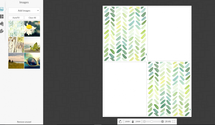
Once you have saved the background image you like, go ahead and add that image from the saved location.
Step 6
I don’t like how close the margins are together on the squares on this image, so I am going to go ahead and select the little palette image and widen the spacing a bit.
Step 7
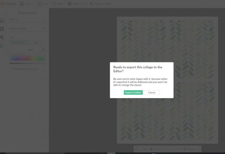
Once you have the spacing the way you would like, click the button on the top of the screen that says, “Export to Editor.” This screen will pop up. Go ahead and click it.
Step 8
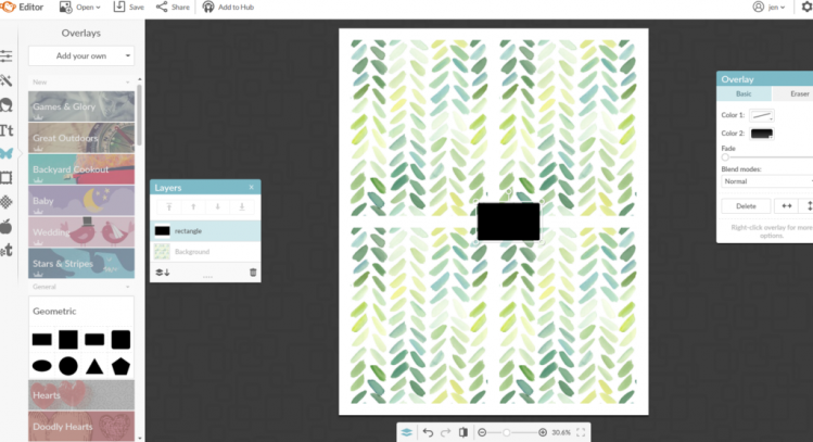
For this card I wanted to have a white rectangular area to write and design in, so select the Geometric button. I clicked on the first shape and monkeyed (get it) with it until it filled the space like I wanted it to.
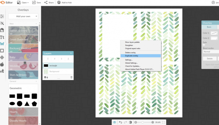
Next, right click on the shape once you have it the way you want it and duplicate it for the other boxes.
Step 9
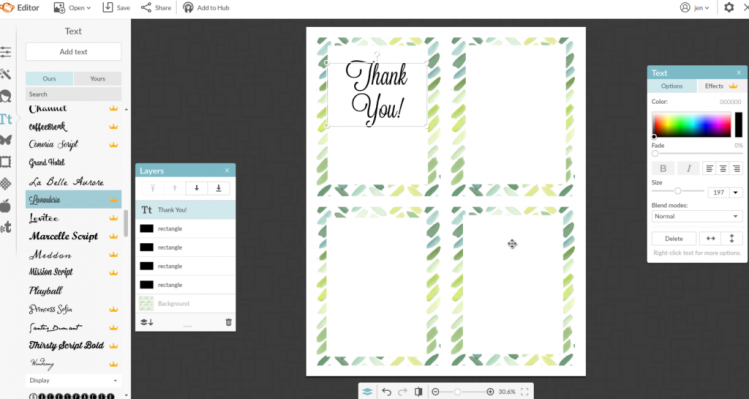
Let’s start designing! There are so many fabulous fonts, but for this one I selected Launderia. Within the writing and font tool you can also change the color to whatever you like. I thought a nice light blue color looked pretty.
Step 10
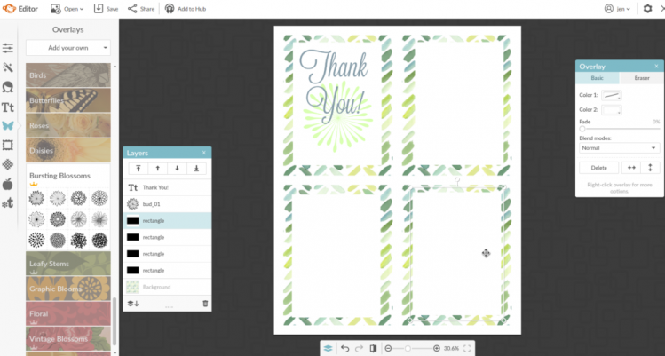
I thought a pretty visual element would be nice, so I selected a bursting bloom and again “monkeyed” around with the color and size until I liked how it looked.
Step 11
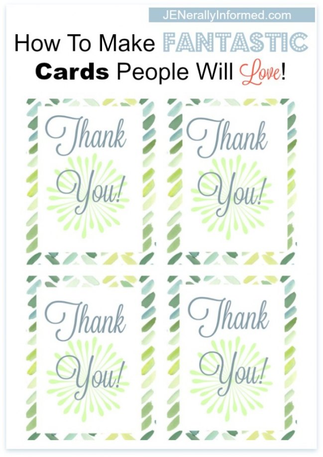
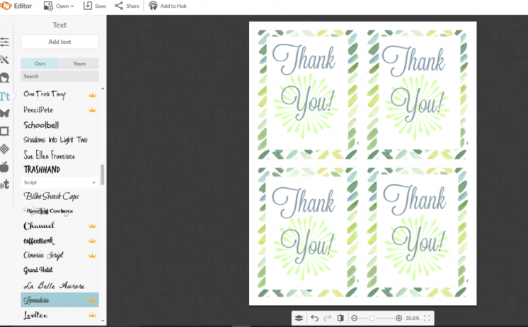
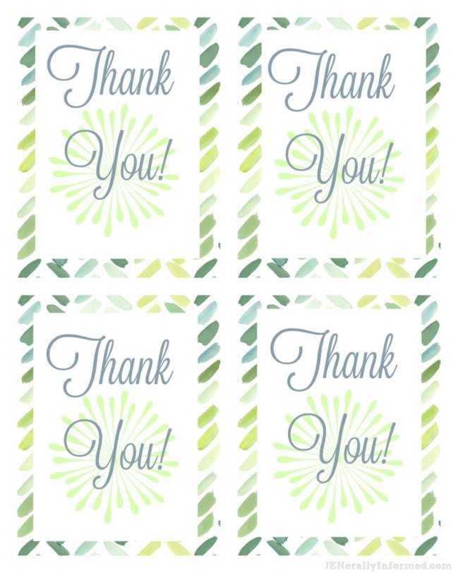
Next, like I showed you how to do above. Set the lettering and the embellishment where you want them by right clicking on both the lettering and the embellishment to duplicate them and set then them up in each white space. Finally, right click on the lettering and select the option to bring it forward. It will end up looking like this when you are done.
Step 12
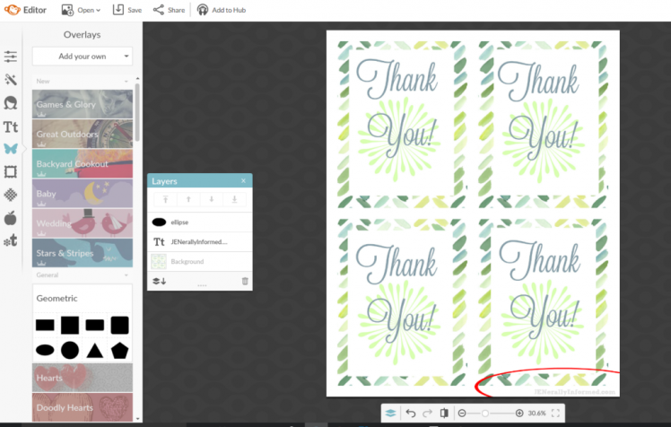
This next step is optional, but since I am sharing this card on the web, I like to add a little watermark in case people want to check out all the fun stuff I share over here.
So here is what the final cards look like. If you would like to pick them up to use right now, you can grab them here!
So voila! Now you are a card making expert! If you liked this post, you might want to check out this other tutorial.
Jen

Go ahead and share this post, you know you want to!

