*This post contains affiliate links.
Good images are vital if you want to be a professional blogger. Unfortunately this is not always an innate talent. When I first started blogging my images were terrible! I cringe when I think back to those blurry photos that I took with my really crappy cell phone, but it was all I had and now almost 5 years into my blogging journey I have learned a few tricks about making great blog post feature images. I also upgraded to a real DSLR camera. All of which has helped to make my blogging images about a million times better.
If you are new to blogging and can’t yet afford to buy a great camera don’t worry there are definitely some ways you can work around that. Here are a couple of ideas for helping to up your blog feature images:
First, I write about family, parenting and motherhood over her quite often. I detest school pictures and so every year I budget money for a professional photographer. By purchasing these images and the full digital use associated with them I have been able to create some great blog features images.
Like this article I wrote about why I still nurse my 2 year old.
Or this post explaining why I just can’t stay in touch.
Both of these posts, went viral on Facebook and have been shared many, many times since they were originally shared. Keep in mind that each platform has their visual alignment preferences. Horizontal images like this are fabulous for most social media outlets except Pinterest, which prefers long and vertical images.
If professional photos like this are not something you can afford right now. Here is another way to make great blogging images.
Use PicMonkey !
All of the blogging feature images you see above were created using PicMonkey. Recently I finally became an affiliate for PicMonkey because I love their service that much. Using PicMonkey in my blogging images has literally made me money and so I cannot say enough good things about signing up to receive the full Royal services. If you use the following offer to sign up I will receive compensation, so thank you!

I mentioned above that you need to keep in mind how to format your pictures across various social media platforms. I do this by creating both a vertical and horizontal image for all of my posts. This way right within the post I have a way for my readers to share the image they want in the alignment that works best for each platform. This is important because each of those shares helps to get more eyes on your posts and blog.
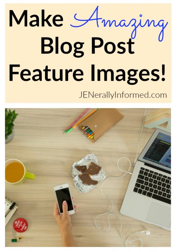
Here is the pinnable image for this post. I did this by first grabbing a great image off of Unsplash and then using the collage element within PickMonkey.
Here is the horizontal image I created that works best for Facebook, my home page and Twitter.
Lastly, don’t forget to watermark your images! You don’t want your hard work or the images of your family being stolen and used elsewhere without your permission!
I hope this tutorial has helped!
Stay Happy! Stay Informed!
Love,
Jen

Go ahead and share this post, you know you want to!


